


Twentieth Century Fox Film Corporation
Main Logos
-

-
 Movietone "Presents" variant
-
 In-credit variant


-
 Movietone drawn version with "presents"
-
 Movietone drawn version with "presents", transparent


Visuals: On a black background, 3 rows of words, "20th", "CENTURY", and "FOX", apparently carved out of stone and/or metal, are seen. The words are "stacked" on top of each other, with similarly carved lines separating the rows. The "20th" is the biggest row, with "CENTURY" and "FOX" a bit smaller.
Variants:
- Sometimes, issues of Fox Movietone News have the logo in a fabric background, and has the text "Presents" italicized and having a drop shadow under the structure.
- Other times, issues of Fox Movietone News a drawn version of this, having the grey shade and background be replaced with superimposed live-action footage, and adding "presents" in script, below it. Sometimes, this version is transparent, having the outlines outlined instead of fully drawn.
- When Fox Movietone News was globalized in different languages, the logo was drawn differently. For example, one issue of Fox Movietone Nieuws (the Dutch newsreel run of Fox Movietone News) has the logo drawn out of white and grey shades on a black background.
- An in-credit variant exists at the start of Col. Stoopnagle's Cavalcade of Stuff No. 2.
Technique: A printed painting or image.
Audio: Either a drumroll or a bombastic orchestral theme.
For technical reasons we are unable to include this table here. To view a listing of where this identity can be found, click here.
-
 1935 version
-
 1940 version
-
 Computer-colorized version
-
 Early Technicolor version #1
-
 Early Technicolor version #2
-
 Early Technicolor version with a pink/blue tint to it
-
 Enhanced color version
-
 Enhanced widescreen color version
-
 The 20th Century-Fox Hour version


-
 Soviet variant
-
 Soviet variant (B&W)
-
 Soviet variant (Sepia)
-
 1950 Soviet variant
-
 1968 Soviet variant
-
 1970s Soviet variant


-
 Wee Willie Winkie (1937): The logo is in a sepia-tone.
-
 Those Magnificent Men in Their Flying Machines (1965): The opening shows a vaudeville-era curtain with a piano playing. As the drumroll plays, the curtain lifts to show the logo, complete with a version of the fanfare played by a piano and an off-kilter trumpet.
-
 Batman (1966): On the Blu-ray release, the logo is cropped to widescreen.
-
 Star! (1968): The logo is in a sepia-tone.
-
 At Long Last Love (1975): The logo seems to be vaguely flashing through different colors.
-
 All This and World War II (1976): Following a series of old 1940s Fox press video clips of various stars and executives supporting the studio and film, the logo, tinted in blue, appears for only a second, then fades out to show the word "PRESENTS" in white on a black background. Also, the opening drum roll of the fanfare segues into the opening music of the film.


Visuals: On a dark sky background, 3 rows of words, "20th", "CENTURY", and "FOX", apparently carved out of stone and/or metal, are seen. The words are "stacked" on top of each other, with similarly carved lines separating the rows. The "20th" is the biggest row, with "CENTURY" and "FOX" a bit smaller. A circular stage-like structure juts out from the base of the "stack," with a light below the structure that shines in front of the "stack". There are pedestals on both sides of the stack, each with a non-moving searchlight. In the background, several searchlights scan the sky.
Alternate Descriptive Video Transcription: Searchlights pierce a starry night sky, sweeping the clouds and illuminating a towering edifice in the form of "20th CENTURY FOX".
Trivia:
- Like the original 20th Century Pictures logo, this was designed by Emil Kosa, Jr.,[2] who would later create the iconic Statue of Liberty matte shot for the ending of Planet of the Apes (1968).
- Alfred Newman's fanfare and the use of Art Deco architecture in the logo's design cement its reputation for future logos to come.
Variants:
- Starting in 1937 with Big Town Girl, the logo was given an newly enhanced look with the structure being slightly different, and the searchlights being a little bigger. The sky in the background was slightly redone as well. This appears in both color (Technicolor) and B&W. Notable films to feature this enhanced look include Gentlemen Prefer Blondes and Coney Island, while the B&W variant only appeared on Titanic (1953).
- On computer-colorized prints, depending on how it was colorized, mostly the computer-colorized versions of Shirley Temple films (one example being Little Miss Broadway) and the Legend Films' colorized version of The Mark of Zorro, the logo would have different colors.
- For early Technicolor releases (except for The Little Princess) starting with Ramona, released on September 25, 1936, the structure is sepia-toned, the left searchlights are pink, the right searchlights are yellow and blue, the "stack" is blue, the middle searchlights are green, and the sky is dark purple. This version was lasted around December 1948.
- On the 1942 Technicolor film The Black Swan, the logo is tinted in sepia.
- Multiple Soviet variants exist:
- On most Soviet prints, the structure is redrawn as a still painting with the words reading "20-Й ВЕК ФОКС". A few seconds later, the text "ПРОИЗВОДСТВО США" in white appears superimposed over the logo. A black-and-white version also exists.
- Sometimes, a different sepia-toned version is used, with different lettering and "США" engraved under "ФОКС". This appears to be painted over an image of the standard logo, as evident by the two front searchlights.
- On a Soviet print of All About Eve, the words are once again painted over a still image of the standard B&W logo, this time reading "20 ВЕК ФОКС". The logo darkens a bit as the white text "Продюсер Дэррил Ф. Занук" fades in.
- A completely different variant was spotted on a 1968 Soviet print of Sitting Pretty. It takes place entirely on a black background with the white text "ПРОИЗВОДСТВО XX ВЕК- -ФОКС США", with a visible trail behind "XX".
- On a Soviet print of Zorba the Greek, the white text "ПРОИЗВОДСТВО "20-Й ВЕК ФОКС" США" fades in on a black background.
- On current prints of Les Miserables, the logo fades into the National Telefilm Associates logo.
- On the 2002 restoration of the 20th Century-Fox Hour, the "0" is noticeably more circular and has a bigger hole, and there are extra searchlights in front of the logo.
Closing Titles: Superimposed on a special background or sometimes on the last scene of a movie, the words "The End" fade in (with the font varying depending on the movie) with the following text: "Released through Twentieth Century-Fox Film Corporation", "Released by Twentieth Century-Fox Film Corporation", "Produced and Released by Twentieth Century-Fox Film Corporation", or "Produced and Distributed by Twentieth Century-Fox Film Corporation".
Technique: The monument was created as a painting on several layers of glass, and the searchlights were traditionally animated frame-by-frame; this was done by the special effects department of the studio.
Audio: A redone variant of the 20th Century Pictures fanfare once again composed and conducted by Alfred Newman.[3]
Audio Variants:
- On some films, the logo is silent or has the film's opening theme. An example of films to have these film's opening themes includes All About Eve, The Song of Bernadette, The Gunfighter, Stars and Stripes Forever, Leave Her to Heaven, Gentleman's Agreement, The Keys of the Kingdom, and Forever Amber.
- On some 20th Century Pictures films, such as one print of The Call of the Wild, the original TCP fanfare is heard due to sloppy plastering.
- On Zorba the Greek, one of the last films to use this logo, the first half of the 1953 CinemaScope fanfare is heard.
- On Love Under Fire, a different recording of the fanfare is heard.
- On the 1994 U.S. Studio Classics VHS release of Carmen Jones, the 1979 fanfare is heard, likely due to a reverse plastering error.
- On Seven Arts TV prints, the CinemaScope extension fanfare that debuted with the next logo is used (the extension is also heard over the Seven Arts logo).
- The 20th Century Fox Hour uses that show's fanfare; a voice-over from Restoration of the 20th Century Fox Hour can be heard in the video.
For technical reasons we are unable to include this table here. To view a listing of where this identity can be found, click here.
For technical reasons we are unable to include this table here. To view a listing of where this identity can be found, click here.
For technical reasons we are unable to include this table here. To view a listing of where this identity can be found, click here.
For technical reasons we are unable to include this table here. To view a listing of where this identity can be found, click here.
For technical reasons we are unable to include this table here. To view a listing of where this identity can be found, click here.
For technical reasons we are unable to include this table here. To view a listing of where this identity can be found, click here.
For technical reasons we are unable to include this table here. To view a listing of where this identity can be found, click here.
For technical reasons we are unable to include this table here. To view a listing of where this identity can be found, click here.
For technical reasons we are unable to include this table here. To view a listing of where this identity can be found, click here.
For technical reasons we are unable to include this table here. To view a listing of where this identity can be found, click here.
For technical reasons we are unable to include this table here. To view a listing of where this identity can be found, click here.
For technical reasons we are unable to include this table here. To view a listing of where this identity can be found, click here.
For technical reasons we are unable to include this table here. To view a listing of where this identity can be found, click here.
For technical reasons we are unable to include this table here. To view a listing of where this identity can be found, click here.
For technical reasons we are unable to include this table here. To view a listing of where this identity can be found, click here.
For technical reasons we are unable to include this table here. To view a listing of where this identity can be found, click here.
For technical reasons we are unable to include this table here. To view a listing of where this identity can be found, click here.
For technical reasons we are unable to include this table here. To view a listing of where this identity can be found, click here.
For technical reasons we are unable to include this table here. To view a listing of where this identity can be found, click here.
For technical reasons we are unable to include this table here. To view a listing of where this identity can be found, click here.
For technical reasons we are unable to include this table here. To view a listing of where this identity can be found, click here.
For technical reasons we are unable to include this table here. To view a listing of where this identity can be found, click here.
-
 Scope version
-
 1954 version
-
 1955 version
-
 Fullscreen version
-
 Black and white version
-
 Black and white fullscreen version
-
 Cropped scope version
-
 Widescreen version


-
 1976 version
-
 1976 scope version
-
 1976 fullscreen version
-
 1976 zoomed-in version
-
 16mm version, cropped


-
 Pan-and-scan version with blue fill
-
 Pan-and-scan version with green fill


-
 CinemaScope snipe
-
 Black and white version
-
 With "PRODUCTION" underneath
-
 Crooked text
-
 Smaller text
-
 French variant
-
 Italian variant (The Hustler)
-
 Italian variant (Daddy Long Legs)
-
 French "Présente" snipe
-
 Spanish variant (Love Me Tender)


-
 1962 Soviet snipe
-
 1970s Soviet snipe
-
 Alternate 70s snipe


-
 The Robe (1953): Known for being the first movie filmed in CinemaScope, this was the debut of the iconic 20th Century Fox "CinemaScope" logo. Here, the sky background is replaced with a red curtain backdrop.
-
 Prince Valiant (1953): Instead of the blue sky background, the CinemaScope credits are on a purple curtain background.
-
 Peyton Place (1957): The logo is in a shade of orange.
-
 Will Success Spoil Rock Hunter? (1957): Tony Randall appears onscreen during the logo and, using a trumpet, a snare, and a bass, plays along to the fanfare. Afterward, he says: "Oh, the fine print they put in an actor's contract these days!"
-
 What a Way to Go! (1964): The logo is tinted in raspberry pink, Pinky Benson's favorite color. Also, the "0" is largely tilted.
-
 Butch Cassidy and the Sundance Kid (1969): The logo is sepia-toned.
-
 The Culpepper Cattle Co. (1972): The logo is sepia-toned.
-
 Fox Movietone Nieuws (1973): The logo is in black and white and has the text "BRENGT U" at the bottom, which then fades out.
-
 Young Frankenstein (1974): The logo is in black & white, in the style of the movie.
-
 Silent Movie (1976): The 20th Century Fox logo is seen about a minute into the movie after the three main characters take the pregnant woman in the car with them; the camera pans, and a 20th Century Fox billboard is seen, but the letter "O" seems to be coming out at the camera, and from it comes a red screen and the opening credits begin.
-
 Quintet (1979): The logo fades to a white snowstorm, starting the film.
-
 The Cannonball Run (1981): The logo begins as usual, but then a searchlight is taken out, causing the music to wind down to a stop. Police sirens and car engines are then heard. Another searchlight is taken out, and an animated Ferrari colored red appears. It makes itself into the "0" while the cop takes out the last three searchlights. The police car crashes into the searchlight on the right. The Ferrari comes out of the "0", honks, and laughs in a Burt Reynolds fashion. This logo is usually edited out of television airings. The logo also looks different than its original design (most likely because this variation was designed by Hal Needham, the director of the movie, and not Rocky Longo). This logo was reused for 20th Century Fox Records discs.
-
 Chariots of Fire (1981, Non-USA): The logo is zoomed in and silent. This has so far has been seen on SKY TV and Fox Classics airings, along with some Blu-ray prints; all other prints have had the 1994 logo plastered over. US prints use The Ladd Company logo.
-
 Down with Love (2003): The News Corporation byline is present along with the 1997 fanfare, and it's also cropped to the 2.39:1 aspect ratio. The film was shot with Panavision optics but used the credit as a throwback to the 1950s-60s films it references.
-
 Send Help (2026): The word "FOX" is replaced by "STUDIOS" to reflect the studio's current name. Plus, the front-right searchlight is now moving just like the the 6th and 7th 20th Century Fox logo and standard 20th Century Studios logo, and the sky background is redone. In addition, instead of using the original fanfare, the 1997 fanfare is used. This was done by yU + co.[4]


Visuals: A redrawn version of the previous logo, but the back of the structure now has a visible ending point, the "0" in "20th" is slanted at an angle and leans towards the right, the left searchlight is redesigned and sits higher atop its tower, and the two searchlights in front of the camera have been removed.
Trivia:
- This logo was designed by Pacific Title artist Rocky Longo, who also designed the next two logos. The "0" was slanted so it would fit within the new CinemaScope aspect ratio.
- The extended CinemaScope fanfare has appeared on the two Star Wars score albums. Many other albums also carry this fanfare (albeit rearranged), and can be found on iTunes.
- In December 1977, this logo was adapted as the label design of 20th Century-Fox Records, until the label was closed down in 1982.
Variants:
- 1953-1967: The searchlights are slimmed down, and the structure is placed in the center of the screen with a dark blue sky surrounding it.
- 1957-1987: Like the slanted zero version of the CinemaScope logo, but without the snipe and fades out.
- An extended version without the CinemaScope snipe exists, which is only used on High Anxiety and 1981's History of the World, Part I.
- 1968-1987: The structure and the sky background are off-center and shifted to the left. Starting in 1976 with The Omen, the registered trademark symbol ("®") was added to the bottom-right of the logo, with its colors also looking less saturated.
- A shorter version of this logo exists.
- On older international prints of Chariots of Fire and Breaking Away, the logo is zoomed in, as those films were shot in "open matte" and the logo was not adjusted for widescreen.
- Some pan-and-scan versions of widescreen films have certain colors filling in the empty black screen space. Some early 2000s HBO widescreen airings also have a blue fill, while the 1992 Fox Video VHS release of M*A*S*H has a green fill.
- On a U.S. 16mm print of Star Wars, the logo (and also the entire film) is cropped to 2.76:1.
- An in-credit version of the logo appears at the end of reissues of films such as 1924's The Iron Horse, 1925's Riders of the Purple Sage, 1926's What Price Glory? and 1927's 7th Heaven. Set on a blue background, this variant has a simplified illustration of the structure with "20th" squeezed vertically and off-center, and there are sun-like rays and MGM-esque ribbons on the top and sides of the structure, respectively. At the top and bottom, respectively, are the words "In association with" and "Twentieth Century-Fox" (with the right arms of the "T" and "F" extending past the subsequent letters and a line above the rest of "Century").
Snipes:
- CinemaScope: The logo fades to the text "TWENTIETH CENTURY-FOX PRESENTS A CINEMASCOPE PICTURE (or PRODUCTION)", with "CINEMASCOPE" having a visible trail.
- On the 2015 Reader's Digest DVD release of Boy On A Dolphin, some of the edges of the "CINEMASCOPE" text are cut off. This error only appears on this release, as the later Kino Lorber print and some earlier VHS versions don't have this issue.
- On The Story of Ruth, the "CINEMASCOPE" text is smaller, more tightly spaced and shifted upwards.
- On a French airing of Journey to the Center of the Earth, the text reads "20th CENTURY-FOX Présente UN FILM CINEMASCOPE".
- On an Italian airing of The Hustler, the text reads "TWENTIETH CENTURY-FOX PRESENTA UN FILM CINEMASCOPE".
- On early Italian prints of Daddy Long Legs, the text reads "TWENTIETH CENTURY-FOX PRESENTA UNA PRODUZIONE IN CINEMASCOPE" and is superimposed over the film's opening credits.
- French "Présente" snipe: On La Métamorphose Des Cloportes, the logo fades to the text "TWENTIETH CENTURY-FOX Présente".
- On a Spanish print of Love Me Tender, the snipe reads "TWENTIETH CENTURY FOX PRESENTA UNA PELICULA CINEMASCOPE"
- Soviet Russian snipes:
- On a 35mm Soviet print of The 300 Spartans, the CinemaScope snipe is replaced by a blue background with white Russian text reading "ПРОИЗВОДСТВО 20-Й ВЕК ФОКС США".
- Another Russian snipe was spotted on a 1970s Soviet print of Cleopatra, where the background is black and the text reads "ПРОИЗВОДСТВО «XX ВЕК ФОКС» США".
- On a Soviet print of The Sound of Music, the "20-Й ВЕК ФОКС" text is set in a cursive font.
Technique: The monument was created as a painting on several layers of glass, and the searchlights were traditionally animated frame-by-frame; once again, this was done by the special effects department of the studio.
Audio:
- November 5, 1953-1960: The 1953 recording of the original fanfare, which debuted on How to Marry a Millionaire.
- April 30, 1954-1967: The original fanfare is extended for CinemaScope. After the point the original fanfare would've stopped, four ascending string notes play, followed by four horn/drum notes. This repeats twice before ending in a majestic flourish. This version was once again conducted by Alfred Newman, and debuted on River of No Return. After CinemaScope was dropped in 1967, the 1935 fanfare was only used from this point on, until the CinemaScope extension returned on Star Wars in 1977.[5]
- March 9, 1960: A different recording of the original fanfare, conducted by Nelson Riddle, debuted on Can-Can.
- 1965-October 31, 1981: The 1935 recording of the original fanfare.
- December 21, 1979?-December 11, 1987: A rearranged version of the 1935 fanfare, conducted by Lionel Newman. The earliest known film to have used this fanfare is believed to be Scavenger Hunt, but this has been unconfirmed. This arrangement would be used for the 4th logo and would last until October 1, 1993 with the release of Freaked.
- May 21, 1980: A new recording of the CinemaScope fanfare, performed by the London Symphony Orchestra and conducted by John Williams, which was used on The Empire Strikes Back.
- In other cases, the logo is silent or has the movie's opening theme.
Audio Variants:
- Marilyn Monroe's final and unfinished project Something's Got to Give has the short, slower version of the 1997 fanfare conducted by David Newman. The film can also be found as a bonus feature on The Seven Year Itch special edition DVD, and as the last third of the AMC documentary Marilyn: The Final Days.
- An abridged version of the 1962 variant of the 1954 CinemaScope fanfare exists, which can be heard on a few films such as Fire Sale, Damien: Omen II, Brubaker, Fatso, Willie & Phil, Magic (1978), and the TV movies Miracle on 34th Street (1973), Good Against Evil, and The Diary of Anne Frank (1980).
- Around 1962, the fanfare was slightly modified with reverb and chorus effects, although the regular version was still used until 1967. This would also be used on Star Wars and High Anxiety, both released in 1977.
- History of the World, Part I has a different arrangement of the CinemaScope fanfare by John Morris.
- There are lower-pitched versions of the 1935 and 1954 CinemaScope fanfares that exist on some films.
- Older prints of The Call of the Wild (1935) use the 20th Century Pictures fanfare.
- Recent prints of The Roots of Heaven (1958) and Amazon Prime prints of House of the Damned (1963) both have the 1994 fanfare play over the CinemaScope variant.
- Netflix prints of Apache Rifles (1964) also have the 1997 fanfare play over the CinemaScope variant.
- The original 1977 U.S. Magnetic Video VHS release of Fantastic Voyage has the opening flourish of the Magnetic Video music mistakenly play during the first half of the fanfare.
- Netflix prints of French Connection II use an abridged recording of the CinemaScope extension from The Empire Strikes Back (1999 arrangement).
- The VHS release of Young Guns II has this logo with the 1979 music playing over it instead.
- On a Spanish copy of History of the World: Part I, this logo has the 1981 Gaumont fanfare, due to poor plastering.
- On a Swedish 16mm print of Star Wars (Stjärnornas krig), the second drum roll is repeated, cutting out the first.
- On Damnation Alley, the second half of the CinemaScope fanfare is cut out.
- The 2017 Kino Lorber Blu-ray release and a recent YouTube upload of Scavenger Hunt plaster the logo with Video Mercury Films instead due to a video mastering error.
For technical reasons we are unable to include this table here. To view a listing of where this identity can be found, click here.
-
 Original version
-
 Dark version
-
 Zoomed version
-
 Open-matte version
-
 Enhanced version
-
 Dark enhanced version
-
 Zoomed enhanced version
-
 1965 version


-
 CinemaScope 55 snipe
-
 "Introducing CinemaScope 55" variant
-
 Color alternated variant
-
 Rare CinemaScope snipe
-
 Grandeur 70 snipe
-
 "Twentieth Century-Fox Presents" snipe
-
 "A Twentieth Century-Fox Release" variant
-
 Italian variant


Visuals: A redrawn version of the last logo. The "20" is thicker, the "0" is straightened and the typeface is significantly altered compared to previous and future logos.
Trivia: Just like the previous and next logos, it was designed by Rocky Longo.
Variants:
- 1960-1966: For movies that were shot in 70mm/Todd-AO, such as 1960's Can-Can, 1963's Cleopatra, and 1965's The Agony and the Ecstasy, the logo is enhanced with an improved sky and tweaked colors in the structure and searchlights, which animate a bit slower.
- 1965-1967: The logo does not have the CinemaScope snipe and fades out.
- A zoomed-in variant exists, which is seen on VHS prints of The King & I and The Sound of Music.
- An open matte version exists, which is seen on the Fox Movie Channel bumpers from the 1990s.
Snipes:
- CinemaScope 55: The logo fades to the text "A CINEMASCOPE PICTURE IN (or INTRODUCING) CINEMASCOPE 55", with "CINEMASCOPE 55" in its corporate font.
- A variant with a darker colored sky exists.
- CinemaScope: Some films use a more standard CinemaScope snipe, which appears similar to the one used in the previous logo, but with "CINEMASCOPE" set in its corporate font.
- "Twentieth Century-Fox Presents": The logo fades to the text "TWENTIETH CENTURY-FOX PRESENTS".
- On The Bible in the Beginning..., the text reads "A TWENTIETH CENTURY-FOX RELEASE" with copyright information below it, and takes place against a morning sky background.
- On an Italian print of Cleopatra, it fades to the white text "TWENTIETH CENTURY-FOX PRESENTA".
- Grandeur 70: In 1961, The King and I was re-released in a 70mm version, called Grandeur 70. The logo fades to the text "IN GRANDEUR 70", with "GRANDEUR 70" in its corporate font (arced upwards and with the leg of the first "R" extending below "ANDEUR").
Technique: The monument was created as a painting on several layers of glass, and the searchlights were traditionally animated frame-by-frame; once again, this was done by the special effects department of the studio.
Audio:
- February 16, 1956-1961: The full CinemaScope fanfare from the previous logo.
- 1960-1966: The 1935 fanfare or the opening theme of the movie.
- 1965-1967: Silent or the opening theme of the movie.
- Sometimes, the logo is silent or has the opening theme of the movie.
Audio Variant: On Can-Can, a different arrangement of the short fanfare by Nelson Riddle is heard.
For technical reasons we are unable to include this table here. To view a listing of where this identity can be found, click here.
-
 Color version
-
 Black-and-white version


Visuals: On a blue background, there is a yellow outlined drawing of the 20th Century Fox structure (with "20th" squeezed vertically and off-center). Around the structure, there are sun-like rays and ribbons, covering the top and sides. Respectively, above and below the structure reads "In association with", and "TWENTIETH CENTURY-FOX" (with the right arms of the "T" and "F" extending past the subsequent letters and a line above the rest of "CENTURY").
Variant: On Sunrise, a black-and-white variant is used. This variant also fades in and out.
Technique: A printed painting.
Audio: A piano tune composed by William Perry that consists of a short arpeggio, followed by four notes played twice, ending on one last and low note.
Audio Variants:
- On What Price Glory?, the piano theme is rearranged.
- On Sunrise, the score of the movie is used.
Availability Note: This logo only appears on the Paul Killiam reissues of silent films released by Fox Film Corporation in the 1920s.
For technical reasons we are unable to include this table here. To view a listing of where this identity can be found, click here.
-
 1980s widescreen version
-
 Alternate 1980s widescreen version
-
 1980s fullscreen version
-
 1980s Open matte version
-
 Early scope version
-
 Later scope version
-
 Later scope version, zoomed in
-
 Stretched scope variant
-
 Soviet Russian stretched and cropped version
-
 1985 Soviet variant
-
 1990 Soviet variant


-
 1989 fullscreen version
-
 1989 widescreen version
-
 1989 version cropped into scope
-
 1989 open matte version
-
 1989 open matte version from a 35mm print
-
 January 1994 Academy Screening Schedule variant
-
 1989 closing version
-
 1992 closing version


-
 Johnny Dangerously (1984): When the fanfare finishes, the logo freezes and turns into a picture of colorful shapes that form the logo.
-
 The Sicilian (1987): The logo is in black and white with a shade of ice blue.
-
 Die Hard (1988): The behind-the-scenes featurette has the logo freeze its animation in the middle which then moves up to reveal the movie title.
-
 The Abyss (1989): The logo is heavily cropped. The film was shot in Super 35, a process that created a widescreen image by cropping the top and bottom portions of the frame. Thus, the pan-and-scan version looks normal.
-
 Edward Scissorhands (1990): The logo is tinted winter blue and has snowfall, in keeping with Edward creating snow in the film. On 4:3 full-screen prints, along with the film itself, it is open matted.
-
 Point Break (1991): The logo is heavily cropped, starts its animation when it fades in, and then freezes when it's about to fade out. On 4:3 full-screen prints, along with the film itself, it is open matted.
-
 Speed (1994): The behind-the-scenes featurette has the logo zoomed in faster than usual.
-
 Alien: Isolation (2014, video game): A retro tape effect is used and the 1935 fanfare logo is heard. When the logo is finished, it flickers out like an old TV.


-
 Two of a Kind (1983): The logo is seen, but after a few seconds it begins to spin clockwise and transitions to the start of the trailer.
-
 Revenge of the Nerds (1984): The logo crumbles and falls into pieces, followed by the film's logo rising from the rubble. Also the searchlights are bright and wave wildly (including the two front searchlights, which never move in the standard logo).
-
 Edward Scissorhands (1990): The logo turns blue with snow around it.
-
 Short Time (1990): The logo appears to be in open matte. Only seen on one TV spot, which can be found on the VHS of Total Recall.
-
Speed (1994): Same as the behind the scenes featurette itself. Seen on the theatrical trailer and TV spot #6.
-
 Baby's Day Out (1994): The logo is on a black background, the searchlights are blue, and the spotlights give off blue light.
-
 True Lies (1994, North America): The logo is white boxed on the left with Lightstorm Entertainment on the right. Only seen on one TV spot. However, the movie itself is the first one to use the 1994 logo.
-
 Deck the Halls (2006): The Edward Scissorhands variant of the logo is used.


Visuals: Another redrawn version of the last logo. This time, the structure is as off-center left as the late 1960s variant of the 1953 logo. The searchlights now have a glow (possibly Scanimate) surrounding them, and the sky is in a lighter shade of blue (closer to daytime, as opposed to the night-blue shade of its predecessors), with the clouds looking more "blended".
Trivia: This logo was designed when Rocky Longo repainted the eight-layered glass panels, and straightened the zero. This logo is actually traced over the 1953 logo, as seen if one lines up both variants over each other. It also bears a resemblance to the 1956 logo (particularly the number "20").
Variants:
- On some films, such as Porky's Revenge! and Aliens, the front-left searchlight is pink.
- Some films used a dark, washed-out structure.
- On anamorphic films, the Fox logo would be squeezed to fit on standard 1.33:1 film and then stretched with special projector lenses so it could be shown in scope, though the first two Die Hard films and The Adventures of Ford Fairlane use a version where the logo is not squeezed, and thus is stretched out horizontally (at the request of the films' producer, Joel Silver, who liked the stretched look after a mishap with an editor accidentally splicing in a flat logo in the anamorphic print).
- Another scope variant which was done for films shot in Super 35 also exists, where the 1.85 variant was cropped to 2.35/2.39.
- On a few films shot in scope, the logo is in extreme close-up.
- On a couple of films, the logo is placed at a very far distance.
- A 4:3 anamorphically-stretched version also exists, which can be found on the 1989 CBS/Fox Video VHS release of Die Hard as well as Blu-ray, DVD, LaserDisc and VHS widescreen releases of that movie. This version was also seen on TV spots for The Fly (1986) as well as a Soviet release of Die Hard 2.
- Both the 1995 LaserDisc release and the 1999 DVD release of Die Hard use the anamorphically-stretched 2:35.1 scope variant. This also occurs on the LaserDisc and VHS widescreen releases and Soviet/Russian theatrical releases of Die Hard 2.
- Some movies, such as the first two Home Alone films have the logo appear in open matte, which is only seen on the 35mm uncropped film scan prints.
- On Jack the Bear, the right searchlight have a different animation, in which it syncs with the rear one. This is the only variation that does not appear on any other film.
- On Soviet prints of some films, the white text "ПРОИЗВОДСТВО «XX ВЕК ФОКС» США" (the capitalization of "ПРОИЗВОДСТВО" depends on the film) fades in on a black background.
- On an Academy screening schedule book from January 1994, a picture of an open matte reel of the logo is used, with "ACADEMY SCREENING SCHEDULE" written below the structure in white.
Closing Titles:
- Same as the previous, but the text reads as either "Produced and Released by Twentieth Century Fox Film Corporation" or "Released by Twentieth Century Fox Film Corporation".
- In 1990, the text was shortened to either "Released by Twentieth Century Fox" or "Produced and Released by Twentieth Century Fox".
- On The Abyss, The Boy Who Could Fly, FernGully: The Last Rainforest, and My Cousin Vinny, there was a variation which had "RELEASED BY" above the 20th Century Fox print logo.
- Sometimes, there is a variant where it reads "Distributed by Twentieth Century-Fox Film Corporation" above the print logo.
Technique: The monument was created as a painting on several layers of glass, and the searchlights were traditionally animated frame-by-frame; this time the logo was animated by Pacific Title.
Audio:
- May 1, 1981-August 14, 1985: The 1954 CinemaScope extension fanfare. Along with the logo, this version of the fanfare debuted in Savage Harvest (released on May 1, 1981), and would be in tandem with the other three audio variants until Key Exchange (released on August 14, 1985). However as requested by director David Cronenberg himself, The Fly (1986) would use this fanfare to pay tribute to the original film, albeit in an abridged form.
- May 22, 1981-October 1, 1993: The 1979 fanfare by Lionel Newman, which was used in tandem with the longer 1982 version, from Death Hunt (released on May 22, 1981) to Freaked (released on October 1, 1993). Most films would either use this or the long version.
- July 17, 1981-June 24, 1983: The 1935 Alfred Newman fanfare, which was used in tandem with the 1954 CinemaScope extension fanfare and the 1979 fanfare, briefly from Zorro, The Gay Blade (released on July 17, 1981) to Porky's II: The Next Day (released on June 24, 1983).
- August 6, 1982, July 20, 1984-July 1, 1994: A new arrangement of the long version of the 20th Century Fox fanfare, also conducted by Lionel Newman. The first film to use this rendition was The Pirate Movie (released on August 6, 1982); however, it was not officially used until Revenge of the Nerds (released on July 20, 1984). The last film to use this fanfare was Baby's Day Out (released on July 1, 1994).
- In other cases, the logo is silent or has the film's opening theme.
Audio Variants:
- Some prints of pre-1981 films, such as Thunder and Lightning are plastered with this logo, but keep their original fanfare or sometimes use the 1979 variant. In some cases, the logo is silent, like on Hardly Working, or has the opening theme of the film.
- A slightly modified 1980 recording/arrangement by John Williams, as played by the London Symphony Orchestra, was used on Return of the Jedi. This version of the fanfare would be used for the Star Wars films until 2005.
- Similarly, Class Action and War of the Roses also used David Newman's own arrangement, while some films scored by Jerry Goldsmith also use his own arrangement. An arrangement of the Alfred Newman fanfare with a heavy brass section was used on The Chase, composed by Charles Gerhardt.
- A special arrangement made for Alien 3 was composed and conducted by Elliot Goldenthal, where the fanfare is heavily blended with french horns and violin strings, but the fanfare immediately interrupts itself once it almost finishes as the horns and strings wail to build tension before segueing to the opening sequence. That same fanfare would later be used for the soundtrack album for Predator.
- A more funkadelic/hip-hop/R&B-style version of the fanfare was made specifically for the film White Men Can't Jump (1992) by its composer Bennie Wallace.
- Rookie of the Year has the opening music which starts with a drumroll similar to the one that normally would start the Fox fanfare.
- The DVD release of Caravan of Courage: An Ewok Adventure and Battle for Endor: An Ewok Adventure, the French audio track on the 1998 DTS DVD release of Predator, both Amazon Prime Video, Hulu, and Syfy prints of Die Hard 2, the 2012 Sky One airings of Brazil, and the 2012 Seven Network's airing of both Crocodile Dundee movies (the latter four films were based on post-2007 prints, due to reverse plastering errors, respectively) use the 1997 arrangement of the fanfare from the next logo.
- On The Fly (1986), the abridged version of the 1953 CinemaScope fanfare is heard, possibly intentional as a homage to the original.
- On newer prints of Wizards, the logo is out of sync with the 1979 fanfare.
- On AMC's prints of Wall Street, a lower-pitched version of the 1979 fanfare is heard.
- TCM France's print of Inferno (1980) has the 1994 fanfare from the next logo playing over this logo, due to a reverse plastering error.
- On Young Guns (1988), the last note of the 1979 fanfare is cut short.
-
 Open matte version
-
 Open matte bylineless version
-
 Scope version
-
 Scope version #2
-
 Bylineless fullscreen version
-
 Bylineless scope version
-
 Closing variant


).png)


-
 2005 recolor version
-
 Recolor version, brightened
-
 Recolor version, saturated


-
 1992 prototype version
-
 1994 prototype version
-
 Storyboard drawing (sourced from the U.S. Patent and Trademark Office)


-
 Cleopatra (1963, 2001 DVD): The 1994 logo is tinted in amber and is in 3D. Only appears before the DVD menu.
-
 M*A*S*H (1970, 2001 DVD): The 1994 logo is tinted in laurel green and is in 3D. Only appears before the DVD menu.
-
 Die Hard (1988): The 1994 logo is tinted in dodger blue, put on a space background, and is in 3D. Only appears before the DVD menu.
-
 Die Hard 2 (1990): Same as the first movie, but it's snowing on the logo and the 1994 logo is in 3D. Only appears before the DVD menu.
-
 Speed (1994): The 1994 logo is tinted blue and seen on the television at Howard Payne's mansion, and also zooms in through the "0". Only appears before the DVD menu.
-
 Die Hard With a Vengeance (1995): The 1994 logo is a bright gold color and appears in 3D. Only appears before the DVD menu.
-
 Far from Home: The Adventures of Yellow Dog (1995): The 1994 logo has a tawny tint.
-
 20th Century Fox: The First 50 Years (1997, 20th Television): By the end of the program, the 1994 logo is bylineless. At the end of the logo, a searchlight brightens (a la the Searchlight Pictures logo) as it transitions to the end credits.
-
 20th Century Fox: The First 50 Years (1997, unused): The left searchlight reveals a more simplified version of the 1994 logo, resembling the print logo at the time. The rows of lines are now made out of glass, and the letters and searchlights are platinum. Created by Pinnacle Productions.
-
 Star Wars: Episodes IV-III (1997-2005; Special Edition (Episodes IV-VI) and 2019 Disney+ release): The 1994 logo is already in its position. Only seen on the original releases. The 1994 logo is bylineless in the Disney+/4K prints. In the 2015 digital release of the films, the 1994 logo with the News Corporation byline is removed, except for Episode IV, as 20th Century Fox holds distribution of the film at the time. Just like the original trilogy, the logo fades out to reveal the 1996 Lucasfilm logo. On the Disney+/4K prints, it fades out to the 2015 Lucasfilm logo. It is also the first track of the 2004 version of the score soundtrack for the original trilogy as "20th Century Fox Fanfare". According to the soundtrack, Alfred Newman (the original composer of the fanfare) was credited.
-
 Turbo: A Power Rangers Movie (1997): The 1994 logo has a golden tint.
-
 Volcano (1997): The 1994 logo moves up until the screen is black and the credits start, and it also has a golden tint to it.
-
 Speed 2: Cruise Control (1997): The fanfare is re-orchestrated by Mark Mancina (the film's composer who later composed the 2006 Disney fanfare) and after it finishes, the 1994 logo is swept away by water, segueing into the opening scene of the movie. It is also the first part of the first track of the film's score soundtrack as "Twentieth Century Fox Fanfare / Motorbike Chase". According to the soundtrack, Alfred Newman (the original composer of the fanfare) was credited.
-
 Speed 2: Cruise Control (1997, 2002 DVD): The 1994 logo is blue and in 3D, the background is black, and the logo is seen on a computer screen similar to Windows 3.1. Only appears before the DVD menu.
-
 How Stella Got Her Groove Back (1998): The 1994 logo is in a shade of orange.
-
 Ever After: A Cinderella Story (1998): The 1994 logo is in a shade of brown and is zoomed-out more than usual (less-than open-matte).
-
 Drive Me Crazy (1999): The 1994 logo is in a shade of vermilion.
-
 Men of Honor (2000): The 1994 logo is zoomed out way further than usual (open-matte) and is in a shade of metallic gold.
-
 Digimon: The Movie (2000): On older prints, the logo is tinted dark blue.
-
 X-Men (2000), X2 (2003) and X-Men: The Last Stand (2006): The X in the 1994 logo stays for a brief moment after the logo has faded out.
-
 From Hell (2001, DVD): The 1994 logo plays as normal, but after several seconds, the logo turns sepia, animates in reverse and speeds up. Only appears before the DVD menu.
-
 Moulin Rouge (2001): Footage of the 1994 logo plays on screen in a concert hall behind draped red curtains. A conductor on stage is conducting the orchestra playing the fanfare, which can be seen below the stage. The orchestra's warmup and the audience's applause sounds for when the conductor arrives on stage, as well as the conductor's baton being tapped three times, are heard before the fanfare.
-
 Planet of the Apes (2001): The background in the 1994 logo changes to space and the Fox structure slowly fades into the opening sequence. Also, the logo is pushed to the left and has a large green-yellow tint.
-
 Dr. Dolittle 2 (2001): The 1994 logo is in international Klein blue. On small widescreen prints, the 1994 logo is in 16:9 open matte.
-
 Ice Age (2002): The 1994 logo is stretched out and snowing sounds are heard at the end of the logo, segueing into the opening scene. On 35mm uncropped film scan prints, the 1994 logo is zoomed out further than usual (open-matte).
-
 Minority Report (2002): The 1994 logo takes place in underwater scenery.
-
 Phone Booth (2003): The 1994 logo fades into a mist of clouds. On small HD widescreen versions, the 1994 logo is zoomed out further than usual (open-matte).
-
 The League of Extraordinary Gentlemen (2003): The 1994 logo animates as normal, but at the end it turns dark and the structure also turns into some obscure buildings. Created by Minoru Sasaki and Robert Stromberg at CafeFX.
-
 Daredevil (2003, DVD): The 1994 logo turns into something seen though Matt Murdock's enhanced senses. Only appears before the DVD menu.
-
 The Day After Tomorrow (2004): The 1994 logo turns lapis lazuli blue and a thunderstorm appears in the background.
-
 Kingdom of Heaven (2005): The 1994 logo is tinted in dark yellow-ochre.
-
 Elektra (2005): After the sunflash, the 1994 logo turns black-and-white, which also appear darker and contrasted.
-
 Fantastic Four (2005): When the 1994 logo finishes, the logo turns red and then fades to the 2002 Marvel logo (much akin to the Lionsgate and Columbia/Tristar film The Punisher).

,_DVD).png)


_variant).png)


-
 Garfield: A Tale of Two Kitties (2006): When the 1994 logo finishes, it turns red as the camera zooms out to show it on a flag. On 4:3 fullscreen prints, the 1994 logo is shown in open matte. (1/2)
-
 Garfield: A Tale of Two Kitties (2006): When the 1994 logo finishes, it turns red as the camera zooms out to show it on a flag. On 4:3 fullscreen prints, the 1994 logo is shown in open matte. (2/2)


-
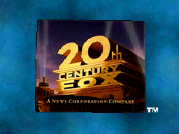 Eragon (2006, video game): On the Nintendo DS version of the video game, the 1994 logo is inside a box on a windy background.
-
 Fantastic Four: Rise of the Silver Surfer (2007): Exactly like the first film, but the 1994 logo turns blue when the flipbook page appears. On small widescreen prints, the 1994 logo is cropped to 16:9.
-
 Live Free or Die Hard (2007): The 1994 logo glitches and the searchlights also go out due to a power outage.
-
 The Simpsons Movie (2007): The movie itself is the first one with the brighter enhanced version of the 1994 logo. Here, Ralph Wiggum (voiced by Nancy Cartwright) walks out of the "0" in "20th" and sings along to the second half of the 1997 fanfare. The logo then turns black and white as the camera pans up to the moon. Also, the 1994 logo is cropped to 16:9 aspect ratio to match the prologue. The animation for Ralph is also done by 20th Television Animation.
-
 The Seeker (2007): The 1994 logo plays normally until the end, when it turns selective yellow. A pair of swirls, representing the first sign, also appear in the sky.
-
 Krabat (2008, Germany): When the animation finishes, the 1994 logo turns stormy as several crows pass over, and the 1994 fanfare is also used.
-
 X-Men Origins: Wolverine (2009, video game and movie trailer): The 1994 logo is made of adamantium (the indestructible metal that covers Wolverine's entire skeleton in the comics).
-
 High Security Vacation (2009, Russia): The 1994 logo plays as normal, but the 1997 fanfare is out-of-sync. When the camera passes the middle searchlight, the whole logo turns into a Chinese-styled painting that quickly disappears into dust, transitioning into the Channel One logo as the fanfare fades out.
-
 Predators (2010): On all five character video profiles for the movie, the 1994 logo is tinted in blood red.
-
 Ice Age: Dawn of the Dinosaurs (2009, 3-D): The logo is carved out of stone, with snow topping above it among a prehistoric backdrop, surrounded by snow-covered pine trees. A volcano pit replaces the "stage" and the searchlights are also replaced with an assortment of smoke-spewing geysers. This variant is only seen on the 3D version; the 2D version uses the regular 1994 logo instead. However, it is seen on the 2010 Blu-ray 3D release, as well as the 2009 TrioScopics 3D DVD release. This was done by Blue Sky Studios.


-
 Young Frankenstein (1974, 2016 Fathom Events re-release): The 1994 logo (in black and white) is in a frame on a black background.
-
 Baby's Day Out (1994, another trailer): The 1994 logo in an open matte and also pushed to the left. Seen before True Lies, which was released on July 15.
-
 Nell (1994): The 1994 logo is pushed down a bit and the searchlights are also darker than normal.
-
 Dunston Checks In (1996): The 1994 logo is zoomed in further than usual and is also film deteriorated.
-
 Independence Day (1996): On two TV spots, the 1994 logo is videotaped and a shadow casts upon the tower (referring to the UFOs in the film).
-
 William Shakespeare's Romeo + Juliet (1996): On the teaser trailer, the sky is colored gray and a bullet passes through the 1994 logo.
-
 Anastasia (1997): The 1994 logo is dark blue and has ice and snow on and around it. Notably, this trailer variation also marked the only time that the logo was extended. This variant was done by Planet Blue, and was also seen on a demo reel from Flip Your Lid Animation.


-
 The X-Files: Fight the Future (1998): The 1994 logo glitches into static, just like a computer would do.
-
 Office Space (1999): The 1994 logo is printed out on a piece of paper.
-
 NFL on Fox "Claymercials" promos (1999-2002, Fox Sports): While two promos aired in 1999 and 2000 were set at the Fox Studio Lot commissary, the 1994 logo is shown outside in the window, albeit with the searchlights turned off. The promos were animated by Will Vinton Studios, the predecessor company to Laika, and the voices for James Brown, Terry Bradshaw, Howie Long and Cris Collinsworth were done by themselves, the late John Madden, Calista Flockhart and Eddie Murphy supplied the voices in the former promos.
-
 NFL on Fox "Claymercials" promos (1999-2002, Fox Sports): While two promos aired in 1999 and 2000 were set at the Fox Studio Lot commissary, the logo is shown outside in the window albeit with the searchlights turned off. The promos were animated by Will Vinton Studios, the predecessor company to Laika, and the voices for James Brown, Terry Bradshaw, Howie Long and Cris Collinsworth were done by themselves, the late John Madden, Calista Flockhart and Eddie Murphy supplied the voices in the former promos.
-
 Titan A.E. (2000): The 1994 logo overlaps with the same thing in another position.
-
 What Lies Beneath (2000, international trailer): The 1994 logo appears from a blue smoke, before fading away to the DreamWorks logo.
-
 What Lies Beneath (2000, domestic trailer): The 1994 logo has a slight cerulean tint.
-
 X-Men (2000): The 1994 logo appears made out of metal as if water flowed along a window. Drops of blueish water also leave gradually, and then the logo becomes clearer.
-
 Bedazzled (2000): The 1994 logo zooms down from the top of the screen.
-
 From Hell (2001): The 1994 logo is in a blood red tint.
-
 Kate & Leopold (2001, Germany): There is no camera panning like the "Special Edition" remastered versions of the Star Wars trilogy from 1997 onward and the Star Wars prequel trilogy; it just remains in its usual place until it fades to black. Also, the 1994 logo has no music.
-
 Like Mike (2002): The 1994 logo zooms out on a television set.
-
 Ice Age (2002, teaser trailer): The 1994 logo has the initials "B.C." (which stands for "Before Christ") covering part of the word "FOX", with a bit of the "O" and the entire "X" visible.
-
 Ice Age (2002, other trailers and TV spots): It is exactly the same as the Anastasia variant, but brighter.
-
 Ice Age (2002, 4th trailer): It's the same as the TV spots, but the glaciers close like sliding doors.
-
 Ice Age (2002, remaining trailers): The finished 1994 logo is tinted in blue.
-
 Minority Report (2002): The 1994 logo is tinted blue and it ripples.
-
 Solaris (2002): A brighter version of the Titan A.E. variant.
-
 Life or Something Like It (2002): The 1994 logo goes static, just like a computer or an old television set would do.
-
 X2: X-Men United (2003, teaser trailer): The 1994 logo is in light gray-blue, turns into a pattern of Cerebro tiles and disappears one by one.
-
 X2: X-Men United (2003, theatrical trailer and TV spots): The 1994 logo is tinted in cadet blue.
-
 Phone Booth (2003): The 1994 logo shifts closer after a few seconds.
-
 The League of Extraordinary Gentlemen (2003, teaser trailer): The sky is green and the "0" is replaced with a sort of satellite dish turned backwards.
-
 The League of Extraordinary Gentlemen (2003, theatrical trailer): The 1994 logo is in black and white and the tower also has a metallic effect superimposed onto it.
-
 The League of Extraordinary Gentlemen (2003, TV spot): The 1994 logo is tinted in brownish-gray and shimmers all over.
-
 Cheaper by the Dozen (2003): The 1994 logo blurs into black and is also zoomed out further than usual.
-
 Cheaper by the Dozen (2003, domestic and international trailers): The 1994 logo is still zoomed out further than usual.
-
 Cheaper by the Dozen (2003, TV spots): It is snowing on the 1994 logo and "20th" also gets covered up by "12".
-
 Master and Commander: The Far Side of the World (2003): The 1994 logo is tinted in Maya blue.
-
 Wrong Turn (2003): The 1994 logo is in a Naples yellow color.
-
 Stuck on You (2003): The 1994 logo is zoomed-in.
-
 Chasing Papi (2003): Three dancing palm trees appear in the 1994 logo. Also, the 1994 logo is pushed to the right.
-
 The Day After Tomorrow (2004, teaser trailer): The 1994 logo glitches and turns royal blue like a black and white CRT after a couple of seconds and gets glitched with the static screen footage.
-
 The Day After Tomorrow (2004, theatrical trailer): The 1994 logo is on a thunderstorm background.
-
 The Day After Tomorrow (2004, TV spot): The 1994 logo is upon a dark blue stormy background and lighting also strikes over it.
-
 The Girl Next Door (2004): The 1994 logo flashes in a blink of an eye.
-
 Dodgeball (2004): A crimson dodgeball ball falls down. "20th" dodges it, then goes back to normal.
-
 Paparazzi (2004): The 1994 logo flashes from black and white to color like a camera while camera clicking noises are heard.
-
 I, Robot (2004): The 1994 logo is ocean blue colored.
-
 Alien vs. Predator (2004, trailers): The 1994 logo has a monotone color scheme.
-
 Alien vs. Predator (2004, TV spots): The 1994 logo is negative and zooms out on a television set.
-
 Catch That Kid (2004): The 1994 logo is negative.
-
 Flight of the Phoenix (2004, teaser trailer): A thunderbolt hits the structure. The structure and background appears to be in a shade of gold.
-
 Flight of the Phoenix (2004, theatrical trailer): The 1994 logo is covered in stone and put on an orange storm background.
-
 Garfield: The Movie (2004, teaser trailer and TV spots): The 1994 logo turns orange with Garfield's stripes.
-
 Garfield: The Movie (2004, theatrical trailer): The structure reads "20th CENTURY CAT", and it is also orange with Garfield's stripes.
-
 Garfield: The Movie (2004, theatrical trailer): The structure reads "20th CENTURY CAT", and it is also orange with Garfield's stripes.
-
 Because of Winn-Dixie (2005): On the trailer, the variant seen on Turbo: A Power Rangers Movie and Cheaper by the Dozen is used.
-
 Robots (2005): The already formed 1994 logo is in a robotic-mechanical look. The camera starts at the sky, then works its way downward to the logo.
-
 Robots (2005, TV spot): The regular 1994 logo is on a blue sky background with a robotic-mechanic city skyline behind the logo.
-
 Fantastic Four (2005): The 1994 logo randomly glitches.
-
 Walk the Line (2005): The 1994 logo is in black and white and then turns back to its normal color.
-
 X-Men: The Last Stand (2006): On the teaser trailer, the variant on Titan A.E. and Solaris is used. On another theatrical trailer, the one seen on Miracle on 34th Street and Cheaper by the Dozen is used. On TV spots, the 1994 logo is in lavender.
-
 Ice Age: The Meltdown (2006): The weather in the 1994 logo changes from snowing to burning hot, and it is also tinted in aqua-blue, and then to red.
-
 Ice Age: The Meltdown (2006, TV spot 1): The 1994 logo is tinted in azure and it is also snowing on the logo.
-
 Ice Age: The Meltdown (2006, TV spot 2): The 1994 logo has a ripple effect.
-
 The Omen (2006): The 1994 logo is tinted in crimson-glory.
-
 Borat: Cultural Learnings of America for Make Benefit Glorious Nation of Kazakhstan (2006): On one trailer, the 1994 logo is film deteriorated, and a black box with "AND 20TH CENTURY FOX" is also on the bottom.
-
 Deck the Halls (2006): The structure is decorated with Christmas lights.
-
 Eragon (2006): The 1994 logo is tinted in ginger and covered with black smoke.
-
 Night at the Museum (2006): The 1994 logo is tinted in shadow, and after a couple of seconds, the logo flickers and turns off, just like a television would do. Also, it is snowing on the logo.
-
 Mr. Magorium's Wonder Emporium (2007): This 1994 logo, along with Walden Media and Mandate Pictures are in a blue-black gradient background which is snowing.
-
 Reno 911!: Miami (2007): After a couple seconds, the 1994 logo speeds up and glitched into static and the 2003 revision of the 2002 Paramount Pictures logo.
-
 Fantastic Four: Rise of the Silver Surfer (2007): Blue and black smoke surrounds the 1994 logo.
-
 The Simpsons Movie (2007, TV spots): There is a bitten pink doughnut in place of the "0" in "20th".
-
 The Simpsons Movie (2007, sneak peeks): One variation showed a black and white still image of the 1994 logo, both with and without the first four notes of the Fox fanfare playing. This sneak peeks can be found on Disc 1 of The Simpsons season 9 DVD release and on the Blu-ray Disc of Ice Age: The Meltdown.
-
 The Simpsons Movie (2007, DVD trailer): It is the same as in the movie, except for the film deterioration. This appears on the sneak peeks on the Blu-ray Disc of Live Free or Die Hard.
-
 Alvin and the Chipmunks (2007): The 1994 logo turns black and white. Only on the teaser trailer.
-
 The Seeker (2007): On trailers and TV spots, the top half of the 1994 logo is grey-tinted and sparks fly around the logo.
-
 Hitman (2007): The background of the 1994 logo is dark and everything also starts to flow like water.
-
 Hitman (2007, teaser trailer): The 1994 logo is on a spiderweb.
-
 Hitman (2007, TV spots): The 1994 logo closes like a curtain.
-
 AVPR: Aliens vs. Predator: Requiem (2007): The background is replaced with a dark, dusky navy-blue and it is snowing again. Also, red and green Christmas lights surround the structure, since the film was released for the holiday season.
-
 Australia (2008): The 1994 logo is black and white on the front page of an old newspaper.
-
 Horton Hears a Who! (2008, theatrical trailer): The speck from the movie flies past the 1994 logo.
-
 Nim's Island (2008): The 1994 logo has a transition to the Walden Media logo via a "wipe" effect.
-
 Max Payne (2008): The 1994 logo is in a gull gray color while snow is falling down. Also, the background is replaced with a city skyline.
-
 Mirrors (2008): The 1994 logo is mirrored, hence the movie title.
-
 Babylon A.D. (2008): The 1994 logo is in a seashell-like color.
-
 Krabat (2008, Germany): The structure is white and it is also nighttime.
-
 Valkryie (2008): The 1994 logo is in a box on the left with the MGM logo in the middle and the United Artists logo on the right. A few seconds later, they shift closer. Only on the international TV spot.
-
 12 Rounds (2009): The 1994 logo starts to glitch out to black.
-
 Dragonball Evolution (2009): The 1994 logo is a cartoon for a couple of seconds. Only seen on an international TV spot.
-
 Ice Age: Dawn of the Dinosaurs (2009): The 1994 logo is tinted in dark blue with the structure and "20th CENTURY FOX" in brown and it is also snowing on the logo again.
-
 Post-Grad (2009, TV spot): The 1994 logo is letterboxed with the movie's name and release date on the top and the bottom.
-
 Alvin and the Chipmunks: The Squeakquel (2009): On a standalone logo teaser, as the 1994 logo forms, Alvin, Simon, and Theodore are on the structure, and they are singing a chipmunk-voiced version of the 1997 revision of the 20th Century Fox fanfare. Animation for the Chipmunks was done at Rhythm and Hues Studios, who also did the animation for the film series.
-
 Fantastic Mr. Fox (2009, TV spots): The 1994 logo is on an orange background.
-
 Fantastic Mr. Fox (2009, trailer): The News Corporation byline is already there while the 1994 logo finishes moving into its position.
-
 Tooth Fairy (2010, Filmfreunde helfen! promotion): The 1994 logo is in 3D (made by "laserschwert") with Dwayne "The Rock" Johnson as Derek Thompson from Tooth Fairy on the left and Sid from Ice Age on the right. Halfway through, fireworks shoot to form a giant "75".
-
 Percy Jackson & the Olympians: The Lightning Thief (2010): The 1994 logo fades into a city skyline.
-
 Predators (2010): The 1994 logo is zoomed in further than usual.
-
 Diary of a Wimpy Kid (2010): The 1994 logo transforms into a paper sheet outlined drawing.
-
 Wall Street: Money Never Sleeps (2010): The 1994 logo is in metallic colors rather than golden orange, uses certain elements from the "laserschwert" logo, and takes place in New York City instead of Los Angeles. The "20th CENTURY FOX" text also reflects on a building in the background.
-
 Wall Street: Money Never Sleeps (2010): At the end of the film's teaser trailer, the camera pans to the left from the side of a building (where the middle searchlight would be), to reveal an extensively modified variation of the 1994 logo listed directly above. In place of the company name is the film's title in a Trajan font, and all searchlights (except for the one lighting up the text) have been completely removed.
-
 Angry Birds Rio (2011, Video Game): Red crashes through the screen, revealing the Rovio Entertainment logo on a white background. The 1954 fanfare is also present. This was created by Jussi-Petteri Kemppainen at Kombo.
-
 Santa Claus: Battle of the Magi (2016, Russia): It is snowing once again.


Visuals: On a black background, two searchlights swoop across the screen (first one by one and then both at the same time, in sync with the opening drumroll), revealing a top-down view of the 20th Century Fox structure in its 1981 form, redone in CGI. The camera moves down and then around the structure, revealing a Los Angeles/Hollywood skyline in the distance and a starry, cloudy blue/purple/orange sky in the background. Midway through the camera's panning, a yellow light (most likely the sun) shines behind the structure as the second half of the extended fanfare begins, and the camera pans past an additional searchlight in front of the structure before settling into its more usual position and angle. The orange byline "A NEWS CORPORATION COMPANY" (in Garamond) fades in at the bottom of the screen.
Trivia:
- According to the March 1995 issue of American Cinematographer magazine, the logo was originally conceived as a motion-control shoot and composite of a sweeping pan over and past the structure, with a physical model of the monument constructed for this purpose. To maintain the look of the "original painting" (referring to previous logos), Studio Productions proposed that the logo be created entirely in CGI instead. Topix artist Denis Gauthier modeled the structure on Wavefront's Advanced Visualizer, and created custom software to allow the monument to appear upright in different camera placements. The camera movement and architectural adjustments were then linked together for seamless interactivity throughout the sequence. Steve Soffer, the director of this logo, proposed the addition of the cityscape and Hollywood Hills in the distance.
- If one looks very closely, several hidden details can be found in the background, such as the Hollywood sign in the distance and the signage of fictional restaurants/stores behind the structure, most of which contain the names of past and then-present executives of the studio, its divisions, its parent company, and its sister companies:
- Bell's (referring to Steve Bell, former network production president of 20th Century Fox Television)
- Broughton's Music (referring to Bruce Broughton, who conducted the 1994 fanfare arrangement)
- Burns' Tri-City Alarm (a homage to Studio Productions animator Kevin Burns' late father Joseph Burns, who owned a burglar and fire alarm company in Upstate New York)
- Cash & Carey (referring to Chase Carey, former chairman and CEO of Fox)
- Chernin's (referring to then-News Corporation president (and now Chernin Entertainment owner and The Chernin Group (TCG) CEO) Peter Chernin)
- Comfort Center
- Denis & Tina's Bridal Shoppe (referring to Denis Gauthier, the CGI supervisor at Topix)
- Grossi's Trattoria (referring to Leonard J. Grossi, former executive vice president of 20th Television, senior executive vice president of UPN and president of Columbia TriStar Television)
- Lucie's TV Repair (referring to Lucie Salhany, then-chairwoman of Fox Broadcasting Company and later founder of UPN and co-founder of Echo Bridge Entertainment)
- Lurie's Records (referring to 20th Century Fox music department head Elliot Lurie)
- Mechanic's Auto (referring to Bill Mechanic, then-Fox chairman and chief executive)
- Mitchell's (likely referring to Mitchell Stern, then-CFO of Fox Television Stations, or Chris Mitchell, the founder of Topix)
- Murdoch's (referring to then-News Corporation CEO Rupert Murdoch)
- Petroskey's Deli (referring to then-Fox spokesman Dennis Petroskey)
- Pizzeria Regina
- Steve's Place (likely referring to Bell or Steve Soffer, the executive producer and director for Studio Productions)
- Studio Productions (one of the companies that animated this logo)
- Topix (one of the other companies that animated this logo)
- Zelnick's Video Arcade (referring to former 20th Century Fox CEO Strauss Zelnick)
- There are also cars seen driving through the roads (albeit '90s automobiles tailor made during the logo's era) if one looks more closely.
- This logo's design was previously used for the 1992 20th Television logo.
Variants:
- A prototype version of this logo exists, in which the structure is the same as the 1992 20th Television logo, the sky background is different, and the camera also starts at the default angle before zooming past the structure into the sky. This was created by Richard "Doc" Baily of Image Savant for Studio Productions, and can be found on a trademark specimen created/mailed to U.S. Patent and Trademark Office (USPTO) on September 8, 1993,[6] an Image Savant demo reel dated October 22, 1993; as well as on the 1997 and 2000 documentaries 20th Century Fox: The First 50 Years (albeit in reverse) and 20th Century Fox: The Blockbuster Years respectively.
- Another prototype version also exists, in which the rear searchlights animate differently, and the front-right searchlight leans further left. Also, the Hollywood sign is located directly behind the structure, and the Hollywood hills behind the cityscape look different. The byline also fades in late. This version was seen on a demo reel from Flip Your Lid Animation and on an E! News story about the logo's music.
- A bylineless version of the Flip Your Lid prototype version exists, however only a few frames are shown of it with no byline before it fades out.
- On the "Special Edition" reissues of the Star Wars trilogy from 1997 onward, and on the Star Wars prequel trilogy, only the final shot of the finished logo is seen during the first half of the fanfare, followed by the 1996 Lucasfilm logo during the second half (much akin to the original releases of the first three films). On Disney+/4K prints, both the News Corporation byline and registered trademark symbol are removed from the Fox logo, and the Lucasfilm logo is replaced with its 2015 revision instead.
- A short version of this logo exists, which can be found on The Making of The Pagemaster, the CBS television special I Walk the Line: A Night for Johnny Cash and Hot Summer Days, and was also seen on trailers and TV spots for Fox films.
- An unedited open matte version with neither the byline nor the "®" symbol exists. It also runs at 30fps, since it wasn't transferred to film. While this variant isn't used on any films or programming, the end shot was used for the 1995 20th Century Fox Home Entertainment logo. It was also found on a later Flip Your Lid demo reel and at the end of the aforementioned 20th Century Fox: The First 50 Years.
- On 4:3 fullscreen prints of certain films from late-1998 onward, starting with The Thin Red Line, the logo is zoomed out further than usual.
- On such international releases as The Boondock Saints and The Art of War, Argentine prints of Dungeons and Dragons (2000), and Swiss prints of Rules of Engagement, the 4:3 version of this logo is stretched to widescreen.
- This logo plasters the 1981 logo on most releases of Speed (including the 1995 UK VHS release, the 2002 DVD release, and early-to-mid-2000s HBO airings), although it is off-center. Said variant is also seen on post-2007 releases of Die Hard 2, international DVD releases of Conan the Barbarian (1982) and international Blu-ray and streaming releases of Brazil.
- Starting with Robots (released on March 11, 2005), the colors of the logo were adjusted to be more saturated.
- Starting with The Devil Wears Prada (released on June 30, 2006), the logo's colors were adjusted again to be more brighter and saturated than the last variant prior. Used in tandem with the previous variant.
- Starting with Live Free or Die Hard (released on June 27, 2007, albeit using a variant), the logo's colors were adjusted again to be even more saturated. Used in tandem with the previous two variants. The last film to use this specific variant was Tooth Fairy (released on January 22, 2010 (only for 35mm uncropped film scan prints)).
Closing Titles:
- Like the last logo, until Deck the Halls, the text either reads "Released by Twentieth Century Fox" or "Produced and Released by Twentieth Century Fox".
- On North American prints of Titanic, the text reads "Produced and Released by Paramount Pictures and Twentieth Century Fox". International prints only swapped the studio names the other way around. That same text was also seen in international prints of Braveheart just two and a half year prior, which was not seen in North American prints.
- On The Magic Pudding, the print logo is seen instead of the "Twentieth Century Fox" text, alongside the logos for Icon Productions and Energee Entertainment.
- On Cast Away, the text reads "Distributed by TWENTIETH CENTURY FOX FILM CORPORATION".
- On In the Mix, the print logo scrolls in the credits along with the Lions Gate Films logo.
- On The Dolphin: Story of a Dreamer, the entire logo is used as a closing logo.
- At the end of the first three X-Men films, the U.S. theatrical print and international home media, TV and streaming prints of Glitter, and Death Sentence, the print logo is shown.
- At the end of the DVD film Family Guy Presents: Stewie Griffin: The Untold Story, the 1995 20th Century Fox Television logo is used instead.
- On most post-2006 films, starting with Turistas (the first production from Fox Atomic), no closing logo or in-credit notice is shown at all.
- Though a few post-2006 films would still have the closing text, one such example includes Reno 911!: Miami, which would follow after the 2002 Paramount Pictures logo in North American releases, although it would be the other way around in international releases. Or in rare cases, a print logo would be shown, which was used in the previously mentioned Death Sentence.
- On Não se Aceitam Devoluções, a still, bylineless image of the logo is used as a distribution and co-production credit.
Technique: CGI directed by Steve Soffer of Studio Productions (now Flip Your Lid Animation), modeled by Denis Gauthier, and animated using Wavefront's Advanced Visualizer software in collaboration with Topix[7] and Image Savant, who also did the 1992 20th Television logo based on its model.
Audio:
- July 15, 1994-February 20, 1998: A new arrangement of the extended CinemaScope fanfare, conducted by Bruce Broughton in the 20th Century Fox Scoring Stage (now the Newman Scoring Stage), in which the original 1935 fanfare was recorded. The orchestra is three times bigger, and the fanfare has more reverberation and larger brass/string sections than other fanfares. The last releases (officially) to use this fanfare was Great Expectations. However, a few post-January 1998 films such as The Object of My Affection, Wing Commander, international prints of such Franchise Pictures films as The Boondock Saints, The Whole Nine Yards, and The Art of War, some prints of Lake Placid 2, and some German productions such as Krabat and John Rabe, along with many Brazilian co-productions from Fox during the early to mid-2000s, used this fanfare instead of the 1997 recording. An E! News story on Bruce's fanfare can be seen here.
- November 14, 1997, March 27, 1998-: A slower arrangement of the long TCF fanfare, as performed by the 20th Century Fox Studio Orchestra and conducted by David Newman, whose father Alfred Newman composed the original fanfare in 1933, as well as its extended counterpart in 1954. According to the Twenty Thousand Hertz podcast, this fanfare was recorded to coincide with the re-opening of the Newman Scoring Stage at the Fox Studio Lot in 1997. The first film to use this fanfare was 1997's Anastasia; Fox films kept using the 1994 fanfare until January 1998. The Newton Boys was the first film to officially use the fanfare from that point forward.
Audio Trivia: According to Bruce Broughton, the logo was originally arranged during recording sessions for Baby's Day Out.
Audio Variants:
- On some 1994-1998 films, the amount of reverberation/echo can vary.
- On some films, the 1997 fanfare has a slightly different arrangement, adding "more muscle" to the fanfare. The same thing applies to the Fox Searchlight Pictures logo. The arrangement, which was used on select films, and was even carried over the next logo until 2015, can be heard here.
- The "Special Edition" version of the Star Wars trilogy uses the modified 1954 recording of the fanfare as played by the 20th Century Fox Studio Orchestra and conductor Alfred Newman, and the 1980/83 recording of the fanfare as played by the London Symphony Orchestra and conductor John Williams, respectively. New arrangements of John Williams' fanfare were used on the Star Wars prequel films. The VideoVan VCD print of The Phantom Menace uses the normal logo with 1994 fanfare, but the last half of the Star Wars recording can still be faintly heard on the Lucasfilm logo.
- On the Disney 4K Blu-ray print of Master and Commander: The Far Side of the World, the logo is silent at first, then the 1997 Universal Pictures fanfare in low-tone is played once the logo is almost finished, and it carries over to the Miramax logo. Conversely, the 1997 Fox fanfare, also in low-tone, plays over the Universal logo. This occurs when the DTS-HD Master Audio 5.1 Italian track is selected, likely due to Miramax distributing the film in Italy.
- On the U.S. prints of The Legend of Bagger Vance and most international prints of Braveheart, the opening theme of the film is heard over the logo instead.
- On the early French and UK releases of Asterix Conquers America (Astérix et les Indiens), early-2010s Disney Channel and 2016-17 Freeform airings of Casper: A Spirited Beginning, UK, Australian and New Zealand releases of Shine a Light, and closing variants for Spanish and Argentine releases, the logo is silent.
- On the Image Savant demo reel showcasing the 1992 prototype, the first 14 seconds of "Sweet Lullaby (Ambient Mix)" by Deep Forest, consisting of a relaxing synth-choir theme with synthesized rhythmic sounds that resemble birds chirping, is heard.
- A short version of the 1997 fanfare exists. The only films to feature it are The Darjeeling Limited with the short version of the Fox Searchlight Pictures logo and Marilyn Monroe's unfinished project Something's Got to Give with the 2nd logo. This was also used on the final 20th Century Fox Home Entertainment logo.
- On some prints of Speed and Die Hard 2, the 1981 fanfare is heard, due to plastering the 4th logo. However, other prints use either the 1994 or 1997 fanfares.
- On Anastasia (the 1997 fanfare's debut film), Ever After: A Cinderella Story, some dubs of X2: X-Men United, French Dolby dub of DodgeBall: A True Underdog Story, and Joy Ride 3: Roadkill, the 1997 fanfare has a different arrangement than the one which is currently used. This was also conducted by David Newman.
- On Asian Blu-ray releases of Robots, if the Mainland Chinese 2.0 track is selected, the logo (and the rest of the film) is in PAL-pitch, despite being presented in its original film frame rate (notice the audio stuttering from the time stretch used). This is possibly due to it being sourced from TV broadcasts of the film when shown in China, since PAL is the country's video standard there. This also happens on some films when converted to PAL.
For technical reasons we are unable to include this table here. To view a listing of where this identity can be found, click here.
For technical reasons we are unable to include this table here. To view a listing of where this identity can be found, click here.
For technical reasons we are unable to include this table here. To view a listing of where this identity can be found, click here.
For technical reasons we are unable to include this table here. To view a listing of where this identity can be found, click here.
-

-
 Widescreen version
-
 2009 anamorphic version
-
 Fullscreen version
-
 Open-matte version
-
 75 Years version (1)
-
 75 Years version (2)
-
 75 Years version, open-matte (1)
-
 75 Years version, open-matte (2)


-

-
 Widescreen logo
-
 2013 anamorphic logo
-
 Open-matte version
-
 Fullscreen version
-
 2013 open-matte fullscreen version
-
 2016 enhanced version


-
 Prototype from an Avatar trailer
-
 Prototype from video games
-
 Prototype from a Blue Sky Studios development reel


-
 It's Always Sunny in Philadelphia (2005-): In the episode "Thunder Gun", the 2009 logo is seen in a theater but the 2nd part of it stops abruptly due to a dangerous threat in the theater.
-
 My Name Is Khan (2010, international): The 2009 logo plays, but it appears to be darker and also cuts to black instead of fading out. This logo only appeared in international releases, but the Fox Searchlight Pictures logo only appears in US releases.
-
 Diary of a Wimpy Kid (2010): The 75th Anniversary variant of the 2009 logo plays as usual, but when it finishes, it transforms into a paper sheet drawing. The camera pans back down to the structure (which is seen from the front) before zooming out to reveal the logo on the cover of Greg Heffley's (played by Zachary Gordon) diary. Also, the News Corporation byline and the word "CENTURY" are written in Greg's handwriting.
-
 Diary of a Wimpy Kid: Rodrick Rules (2011): The 2009 logo plays as normal, but with a large orange tint. At the end, it turns into a paper sheet drawing before the camera pans downwards.
-
 Prometheus (2012): The logo has a blue tint, reflecting the film's color palette.
-
 Diary of a Wimpy Kid: Dog Days (2012): Same as Diary of a Wimpy Kid: Rodrick Rules, but this time a paint splash effect is seen before the logo turns into a drawing. A beach ball flies in front of the camera as it pans downwards.
-
 Aliens: Colonial Marines (2013, video game): The 2009 prototype logo is zoomed out further than usual.
-
 X-Men: Days of Future Past (2014) and X-Men: Apocalypse (2016): Same as the variant used in the first three X-Men films, but with the 2009 logo instead. Also, part of the X-Men theme is heard at the end of the fanfare.
-
 The Fault in Our Stars (2014): The logo is seen at nighttime, and when it finishes, the camera pans up towards a starry night sky, a la the variant for The Simpsons Movie.
-
 Gone Girl (2014): The logo is cut short and cuts to the Regency Enterprises logo before the animation is even complete. Also, the logo is in a darker tint.
-
 The Book of Life (2014): A mariachi band rendition of the fanfare is heard, composed by Gustavo Santaolalla. The "0" in 20th is replaced by a skull, the logo is set in Mexico and a graveyard, and the searchlights are replaced by candles. This was supposed to appear on the film itself, but instead was seen on the trailer while the normal logo and fanfare were used. The Mexican fanfare, which was not found in the soundtrack, can be heard here.
-
 Fantastic Four (2015): In a similar vein to the X-Men film series, the '"F" stays for a brief moment after the logo fades out.


).png)


-
 The Peanuts Movie (2015): The 2009 logo plays as usual, albeit in open-matte, but after the opening drums are played, a piano rendition of the fanfare is played, backed with a re-arranged version of the drum track of the normal fanfare, based on the 1994 fanfare, which is later revealed to be performed by Schroeder on his piano, sitting in front of the podium, as the logo finishes turning into its position. There is no registered trademark symbol here (later removed in 2021). Just like the regular logo and the movie itself, the animation of Schroeder was done by Blue Sky Studios.
-
 Independence Day: Resurgence (2016): The logo turns blue-tinted.
-
 A Cure for Wellness (2016): The logo is more darker.
-
 Alien: Covenant (2017): The logo is in a shade of dark blue-gray.
-
 Diary of a Wimpy Kid: The Long Haul (2017): As the fanfare ends, a paper drawing of the logo (this time appearing to have been cut out from a sheet of paper) flips in from the bottom of the screen as several notecards cover the background, followed by the camera panning downward. It's also worth noting that this was the only movie in the franchise to have the bylineless logo.
-
 Condorito: The Movie (2017, Chile): The logo is slightly pushed to the left. A rose petal flies in once the logo forms. Condorito, one of the characters of the film, walks in for the remainder of the logo, picks the petal and walks away once the camera moves to its normal position.
-
 The Greatest Showman (2017): The logo is shown in black and white and at double speed, while the film's opening song ("The Greatest Show") is heard, which continues over to the TSG Entertainment and Chernin Entertainment logos and into the opening credits.
-
 Unsane (2018): Exactly the same as Independence Day: Resurgence, but the sky is darker and is cropped to 4:3.
-
 Alita: Battle Angel (2019): The logo plays as normal until the end, when two searchlights swoop across the screen (a la the 1994-2010 logo), turning the structure into a dilapidated version in the future reading "26th CENTURY FOX", to fit in with the film's setting.
-
 The Balkan Line (2019, Russia): Same as Braveheart and The Legend of Bagger Vance, but with the 2013 logo instead. Once the registered trademark symbol fades in, the logo cross-fades into the Russia-1 logo.
-
 Dark Phoenix (2019): Once the logo reaches its final position, the "X" in "FOX" turns molten red and the background gets darker, hinting at the awakening of the Dark Phoenix.
-
 Terminator: Dark Fate (2019, domestic): The logo plays as usual, but it is given a VHS filter. It glitches to the 1981 logo that is in cyan for a moment before reverting back to its usual colors. This also applies to the following 3 logos (Skydance Media, Paramount Pictures and Tencent Pictures). Both variants were done by Elastic.
-
 Terminator: Dark Fate (2019, international): The logo has VHS static over it, and briefly flashes to the 1981 logo. Both variants were done by Elastic.
-
 The New Mutants (2020): Similar to the Anastasia trailer variant, but with the 2009 logo this time. This was originally planned to appear in the film itself, but due to the 20th Century Studios rebrand, the 2020 logo with the current name was used instead. But, this can be found on Plucky's website.
-
 Deadpool and Wolverine (2024, in-film): During the film, the text from the logo is shown half-buried in the desert within the Void, while Deadpool (played by Ryan Reynolds) and Wolverine (played by Hugh Jackman) are fighting.
-
 Deadpool and Wolverine (2024, in-film): The 20th Century Fox logo appears at the end of the Fox-distributed movies' blooper reels during the closing credits.


-
 Marmaduke (2010) and Vampires Suck (2010): On the TV spots for those films, the logo is in a box on the left with the Regency Enterprises logo on the right.
-
 Ramona and Beezus (2010): The logo is in a box on the left with the Walden Media logo on the right. Only on the TV spot.
-
 Machete (2010): Sparks move around the 20th Century Fox structure.
-
 The Chronicles of Narnia: The Voyage of the Dawn Treader (2010): The logo is bluer than usual and it is snowing in the logo.
-
 Gulliver's Travels (2010): Lightning hits the structure. Seen before the movie has the last time with the 75th anniversary variant.
-
 Big Mommas: Like Father, Like Son (2011): The logo is darker than usual.
-
 Rio (2011): On the first trailer, a darker version of the My Name Is Khan variant is used.
-
 Angry Birds Rio (2011, Video Game): On the "Nigel Mashup", various pigs from the original Angry Birds game, including a King Pig and two Corporal Pigs, are seen on the 2009 logo's structure. Red flies in from the left side of the screen and hits the "2", and King Pig and one of the Corporal Pigs take damage and roll. The Corporal Pig then rolls into the gap in the "20" and pops. The rest of the pigs are seen grinning while the sound of them laughing (played when the player runs out of birds in a level and fails to pop all the pigs) is heard.
-
 X-Men: First Class (2011): The logo is zoomed in further than usual.
-
 Rise of the Planet of the Apes (2011): Same as X-Men: First Class, but brighter.
-
 In Time (2011) and Chronicle (2012): The logo is tinted in pale cerulean, and the logo is on a stormy cloud background.
-
 In Time (2011) and Chronicle (2012): On the latter, it is more bluish-tinted.
-
 The Iron Lady (2011, UK): The logo cross-fades into the Pathé logo.
-
 Prometheus (2012): The 75 Years version of the logo with the byline carved is glitching on a screen.
-
 Prometheus (2012): Another variant has the regular version of the logo tinted somewhat blueish, a la the 1995 Fox Searchlight Pictures logo's variant for Just Wright.
-
 Prometheus (2012): On international trailers, the logo is black and white.
-
 Diary of a Wimpy Kid: Dog Days (2012): Same as Diary of a Wimpy Kid: Rodrick Rules, but a beach ball flies across the logo and it pans down to the rest of the drawing.
-
 Abraham Lincoln: Vampire Hunter (2012): The first half of the logo plays and flickers like a candle. Plus, the logo is darker.
-
 Abraham Lincoln: Vampire Hunter (2012): On another trailer, the logo is greyish.
-
 Life of Pi (2012): Stormy skies surround the logo and lightning strikes.
-
 Parental Guidance (2012): The logo takes place in nighttime and it is snowing.
-
 Runner Runner (2013): The logo is pushed down a bit.
-
 Runner Runner (2013): On the TV spots, the logo is in open matte.
-
 The Wolverine (2013): On a Japanese promo for said film, there is Logan/Wolverine on the top of a Tokyo building with the peak of Mount Fuji visible at a stormy night. Then the screen zooms away through Tokyo as the Tokyo Tower can be seen until it reaches a bronzish Fox structure. The animation continues as usual, albeit in warpspeed, until Wolverine's claws slash through the final product. The logo zooms through the slashes. Despite its obscurity, this trailer variant won a Bronze Clio Entertainment Award in 2013 for audiovisual technique. This variant was designed by PIC Collective.
-
 The Wolverine (2013): On the TV spot, the logo cross-fades to Marvel logo.
-
The Counselor (2013): Same as Runner Runner, but without the registered trademark symbol. Seen on the TV spots.
-
 The Monuments Men (2014): Same as the X-Men: First Class and Rise of the Planet of the Apes variants.
-
 Dawn of the Planet of the Apes (2014): The logo is slightly darker than usual.
-
 Rio 2 (2014): The logo is surrounded in confetti. The Blue Sky Studios logo appears in the same way.
-
The Book of Life (2014): Just the finished product of the film's unused custom variation.
-
 Night at the Museum: Secret of the Tomb (2014) and The New Mutants (2020): Similar to Titan A.E., but it uses the 2009 logo.
-
 The Peanuts Movie (2015): On some trailers and TV spots, it is the same as in the movie, except it shows the final product. On another trailer, the camera panning animation is seen on a TV.
-
 Rico, Oskar and the Heartbreak (2015, Germany): The logo plays at warp-speed, and it's slightly saturated.
-
 Rico, Oskar and the Heartbreak (2015, Germany): In the LEGO version of the trailer, the entire structure (In a weirdly different appearance) is made out of Lego bricks, the sky background and city are different to the regular 2009 logo, and the searchlights are replaced with giant candles which move by themselves. This was made by Alexander Leitner.
-
 The Martian (2015): The logo cross-fades into the Scott Free logo.
-
 Bridge of Spies (2015, International): The logo is blue.
-
 Deadpool (2016): Same as Parental Guidance, but the first half of the animation from the normal logo is used. Seen on a TV spot.
-
 Deadpool (2016): On another TV spot, the logo is boxed on the left with Marvel logo boxed on the right.
-
 Alien: Covenant (2017): The logo is in a shade of dark teal. On TV spots, it is open matte.
-
 Kingsman: The Golden Circle (2017): The logo is in shiny metallic gold and the sky is in an orange sunset color.
-
 Diary of a Wimpy Kid: The Long Haul (2017): In respective order, the "0th", "2", "FOX", the searchlights, "CENTURY", the rest of the structure, and finally the sky, become a paper drawing.
-
 Diary of a Wimpy Kid: The Long Haul (2017): In respective order, the "0th", "2", "FOX", the searchlights, "CENTURY", the rest of the structure, and finally the sky, become a paper drawing.
-
 The Predator (2018): The logo is rainbow-colored, as if it was seen from the Predator's thermal vision point-of-view.
-
 Stuber (2019): The logo is blurry, referencing Dave Bautista's character's blindness in the film. Seen on one trailer.
-
 Spies in Disguise (2019): The logo is in shiny metallic dark blue with the sky being black and the searchlights producing light blue beams, and three searchlights are cut. The Blue Sky Studios logo appears in the same fashion.
-
 Ford v Ferrari (2019): The logo cross-fades into the Chernin Entertainment logo.


Visuals: A complete redesign of the structure, with many elements of the logo sharing little resemblance to their 1956/1981/1994 counterparts. This time, it is in a dark/orange evening environment, and the structure has a more realistic appearance, complete with a rectangular pattern in the center stage. Extra emphasis is placed on the searchlights around the rear (hidden in previous logos), with two appearing in the intro and after the camera stops moving respectively.
Trivia:
- This logo made its first appearance on a trailer for Avatar on August 10, 2009, before making its official theatrical debut with said film on December 10.
- Like the previous logo, if one looks very close in the far right-hand corner before approaching the main structure, the same Hollywood sign (not very big, but still visible if one looks hard enough) from the previous logo can be seen.
- One can also see an Ice Age billboard, cars in the city, and stars at the end of the logo, but there are fewer than the previous logo.
- If one pays attention to the movement of the searchlights (especially when the logo is played in reverse), they can see that their movement is similar to the searchlights from the previous logo, albeit slower and in reverse.
- The "Celebrating 75 Years" variant for TCF's 75th anniversary is a contemporary throwback of (and a contemporary homage to) the 20th Century Fox CinemaScope logo, where the 20th logo faded after ten seconds into the CinemaScope logo; the overall branding for the "Celebrating 75 Years" anniversary including the text included in the logos was created in collaboration with Struck Librarian, an agency in Salt Lake City, Utah. More information on the collaboration, including various unused designs, can be found here.
- On September 16, 2014, 20th Century Fox posted a compilation of the logos and its variants, backed by the 1998 re-recording of the 1997 fanfare (albeit with the drum roll played twice), as a promotion of the new Fox Movies website, on the studio's YouTube channel here.
Alternate Descriptive Video Descriptions:
- 2009-2015: In a logo, a towering block of gold letters reads "20th Century Fox". Hollywood spotlights criss-cross their shining skyward beams.
- 2009-2013 (News Corporation byline, after the above description): More words appear: "A News Corporation Company."
- 2015-2020: Searchlights sweep an evening sky, piercing clouds, and illuminating a towering edifice in the form of 20th Century Fox, with the lights of Hollywood, palm trees, and the hills beyond.
Bylines:
- December 18, 2009-November 5, 2013: "A NEWS CORPORATION COMPANY" (in Minion Pro Bold)
- July 17, 2013-October 23, 2020: Bylineless
Variants:
- Different natively-rendered stereoscopic 3D variants of this logo (and the different variants described below, such as the 75 Years and enhanced variants) exist.
- February 12, 2010-March 3, 2011 (75 Years variant): The variant was produced from January to February 2010 by Struck Librarian for the company's 75th anniversary. On-screen, when the logo finishes its move into position, the camera pans up and two streaks of light draw "75", as two searchlights turned on, after the "75" finishes drawing, with the word "CELEBRATING", appearing letter by letter, above the numbers and "YEARS" below both in spaced-out letters. The camera pans the words and numbers in position. Also, the registered trademark symbol "®" and the News Corporation byline are engraved on different parts of the structure. Plus, the front searchlight leans more to the left before going off-screen, and a searchlight behind the structure has been removed.
- The prototype version had a much darker red-orange sunset sky, harder shading, and different searchlight positions.
- Another prototype version exists, which can be found on two CGI environment reels by Dave Strick, a designer and modeler at Blue Sky Studios. A much different sky is used and the searchlights are less realistic, the front-left searchlight is located in a slightly different position and wireframes fade in on most of the 3D geometry at the end of the logo sequence (the wireframes indicate the parts of the overall structure that Strick modeled). It also lacks the flash before the front searchlight passes in. One version of this has Blue Sky's logo and copyright info (dated to 2008) along the bottom of the screen, while another version has details (including Strick's email address) at the beginning where the logo starts blurry and then gains focus. The latter version can be seen here.
- A short version with a portion of the animation appears on licensed video games, such as Rio: The Video Game and Aliens vs. Predator.
- A still print version can be seen on other games, such as Ice Age: Continental Drift - Arctic Games.
- On some movies with this logo, like Avatar (the logo's debut film) and DreamWorks Animation films such as Penguins of Madagascar and Home, there is an error with the two opening searchlight beams during the fanfare's drumroll. Also, the camera-panning animation is in a slightly different angle, moving back to its usual position as the camera approaches the barrel near the end. This is because these characteristics are normally found in the left eye of the stereoscopic version of the logo, whereas the right eye is the more commonly-used version in 2D prints. Because of this, that means these films included their left-eye image in their 2D versions along with the TCF logo, as opposed to Blue Sky Studios' films for example, which tend to use the right eye image in their 2D versions. This does not apply to every film TCF released in 3D, as a different stereoscopic version is used in films such as Turbo.
- The final seconds of this logo can be seen at the beginning of the 3D conversions of the Star Wars prequels (plastering the 1994 logo variant, before the Lucasfilm logo).
- Starting with Turbo, released on July 17, 2013, the News Corporation byline is excluded, and the logo is bylineless for the first time since the 6th logo, due to the aforementioned split.
- An open matte version exists, which was only seen on TV spots for Runner Runner and The Counselor, The Peanuts Movie (albeit as a variant) and on video games based on 20th Century Fox properties.
- An enhanced variant of this logo exists. This variant includes an improved searchlight opening at the beginning, wider light beams, and more detailed textures. Also, the "X" in "FOX" is brighter than usual. This variant was only used on Ice Age: Collision Course, Murder on the Orient Express, Ferdinand, Terminator: Dark Fate (only at the end; the beginning uses a variant), and Spies in Disguise.
- A sped-up version of the 75 Years variant with the ending theme playing over it also exists, which has been spotted at the end of a Polish airing of the Warner Bros./Regency film Under Siege 2: Dark Territory.
- Sometimes, such as on international prints of My Name is Khan, Joy, and the Maze Runner trilogy, the logo cuts to black instead of fading out as it usually would. On the former, the logo cuts to the Fox Star Studios logo.
Closing Titles: None for the most part, but there are a few variants:
- A short version with only the final shot (similar to the variant seen on trailers and TV spots for many Fox films) is seen at the end of Lincoln, Poltergeist (2015), Rules Don't Apply, all DreamWorks Animation films from The Croods to Captain Underpants: The First Epic Movie (removed from post-2018 prints), Terminator: Dark Fate, the TV specials Ice Age: A Mammoth Christmas and Ice Age: The Great Egg-scapade (TV airings only), and 7flix airings to Ice Age: Collision Course. It's also seen on the short films Maggie Simpson in The Longest Daycare, Rocky and Bullwinkle, Almost Home, and Cosmic Scrat-tastrophe as an opening logo.
- At the end of Parental Guidance, British prints of Misbehaviour and the Brazilian film Ela e Eu, the print logo is shown.
- At the end of the majority of Fox films starting with Taken 2, released in 2012, a disclaimer (usually in white) appears on a black background following the end credits, reading "The making and authorized distribution of this film supported over (number) jobs and involved hundreds of thousands of/over one million work hours." The font varies depending on the film.
Technique: CGI designed by Chris Wedge, Ari Rubenstein and Carlos Saldanha and animated at 20th Century Fox's now-defunct sibling company Blue Sky Studios. This was made using Autodesk Maya and rendered with CGIStudio. Dave Strick was the logo's lead modeler. The glowing effects for the 75th Anniversary text were done using Nuke Compositing Methods.
Audio: The 1997 Fox fanfare composed and conducted by David Newman.
Audio Variants:
- The 2005 recording of the 1989 20th Century Fox Television fanfare is heard at the end of Ice Age: A Mammoth Christmas.
- The 3D conversions of the Star Wars prequels have their respective recordings of the fanfare, arranged by John Williams, playing over this and the Lucasfilm Ltd. logo.
- Starting with the 3D re-release, the 1994 fanfare is heard on international prints of Titanic. This is also heard on the films Klitschko (2011; German prints only), Ausgerechnet Sibirien (2012), Rico, Oskar und die Tieferschatten (2014) and Rico, Oskar und das Herzgebreche (2015), but not Rico, Oskar und der Diebstahlstein (2016), as the 1998 fanfare was used instead.
- The 1981 fanfare is heard on the 3D version of Predator.
- In rare cases, such as The Monuments Men (U.S. release), The Greatest Showman, Gone Girl, Ad Astra, the Russian film The Balkan Line, and Terminator: Dark Fate (both U.S. and international versions), the film's opening theme is used instead.
- In rarer instances, such as U.S. prints of Bridge of Spies, the logo is silent.
- The 2012 recording of the 1989 20th Century Fox Television fanfare is heard at the end of Ice Age: The Great Egg-scapade, albeit quieter.
- For the short version, none, the movie's closing theme, or the trailer's opening theme.
- On most dubbed international prints of Ford v. Ferrari, the music is in a lower pitch, along with those of TSG's and Chernin's logos.
- On a 2020 ABC broadcast of The Greatest Showman, the opening theme of the second half of the movie's logo variant (including the 1953 logo variant in the first half and the broadcast itself) is in high tone, due to the usage of a PAL print.
- The 2016 version has a slight rearrangement of the fanfare, in which it sounds like a combination of the original 1997 arrangement and the 1998 version.
For technical reasons we are unable to include this table here. To view a listing of where this identity can be found, click here.
For technical reasons we are unable to include this table here. To view a listing of where this identity can be found, click here.
For technical reasons we are unable to include this table here. To view a listing of where this identity can be found, click here.
Unused
 | This logo is currently missing in action. Please do not add reconstructions of the logo if any exist, as they are likely not accurate to the actual logo. Additionally, do not attempt to add a finalized description of the logo until it has been found in its entirety. |

Visuals: The logo is similar to the 4th logo, but now in CGI and with some differences, those being a lighter background and darker lighting.
Technique: CGI by Novocom. It can be viewed here.
Audio: Unknown, speculated to be the fanfare from before.
20th Century Studios
-
 Scope
-
 1.85:1
-
 16:9 / Home Entertainment logo
-
 16:9 (open-matte)


-
 Scope version with enhanced 2009 sky
-
 16:9 version with enhanced 2009 sky
-
 2:1 version with enhanced 2009 sky and no "®" symbol
-
 16:9 version with enhanced 2009 sky and no "®" symbol
-
 Scope version with enhanced 2009 sky and no "®" symbol
-
 1.85:1 version with enhanced 2009 sky and no "®" symbol
-
 2.76:1 version with enhanced 2009 sky and no "®" symbol


-
 Corporate logo
-
 1.85:1 with dark sky
-
 Official X (Twitter) account profile picture
-
 Go.com version
-
 Official X (Twitter) banner
-
 Official YouTube banner
-
 Official Bluesky banner
-
 Corporate logo with enhanced 2009 sky
-
 Rare 2021 banner version


-
 The Last Duel (2021): The logo is dimmed to match the lighting of the rest of the film.
-
 Darby and the Dead (2022, Hulu): The logo is brighter than usual.
-
 Barbarian (2022): The color shade is same as the final 20th Century Fox logo.
-
 Boston Strangler (2023, Hulu): The logo is darker than usual and desaturated.
-
 Alien: Romulus (2024): The logo plays normally, but as it reaches its final position, the 1997 fanfare "freezes" like in the Alien³ variant. The logo then glitches, turns green and becomes static shocked as the fanfare becomes horrifyingly distorted before wiping away to the right a few seconds later.
-
 Eenie Meanie (2025): The logo has a film grain effect to it, as well as flickering reminiscent to that of a projector.
-
 Swiped (2025): The logo is more saturated, and the color shade is same as the final 20th Century Fox logo (same to the Barbarian (2022) variant). Plus, the fanfare sounds somewhat muffled and has a phasing effect, specifically near the end of it.
-
 The Hand That Rocks the Cradle (2025): The logo has a more darker tint to it, similar to the Bridge of Spies variant of the final 20th Century Fox logo, except that it plays at its usual pace.


-
 The New Mutants (2020): The logo crossfades into the Marvel logo. Seen on one TV spot.
-
 The Empty Man (2020): The logo suddenly darkens one second into the logo.
-
 Home Sweet Home Alone (2021, Disney+): Same as Parental Guidance, but the normal 20th Century Studios logo is used. Seen on one TV spot.
-
 The King's Man (2021): The logo is tinted in Kingsman gold.
-
 The Princess (2022, Hulu/Disney+): Same as Titan A.E., but the 20th Century Studios logo is used.
-
 Prey (2022, Hulu/Disney+): On the first and second trailers, the 2020 version of the logo is used.
-
 Prey (2022, Hulu/Disney+): On a TV spot, it's the same as The Predator, but the 20th Century Studios logo is used.
-
 Barbarian (2022): The horizontal print logo is beside the Regency Enterprises print logo, both in grungy brown on a black background, which is revealed from a wall.
-
 Amsterdam (2022): The logo is much darker than usual.
-
 The Boogeyman (2023): The logo is initially tinted in red but changes into its normal colors.
-
 No One Will Save You (2023): Just the placeholder original sky background of the logo. The searchlights are replaced with UFO light beams beaming down.
-
 The First Omen (2024): The logo becomes darker as all of the searchlights turn off, except for the left one, which then turn into a fire. This was done by Trailer Park.
-
Alien: Romulus (2024): Same as the movie itself.
-
Predator: Badlands (2025): On the TV spot advertising the film's 3D release, the variant from the Prey TV spot is used.
-
 Send Help (2026): The print logo without the square outline can be seen in brownish gold on the bottom of an elevator door. The door then opens, with both of the logo's halves moving alongside the two halves of the elevator door, as Linda Liddle (played by Rachel McAdams) steps out of it.
-
 The Devil Wears Prada 2 (2026): The print logo from Send Help is reused but this time, its in black on a fogged mirror. It gets wiped by Andy Sachs's (played by Anne Hathaway) hand while brushing her teeth.


Visuals: A more realistic reworking of the final 20th Century Fox logo, albeit with the word "STUDIOS" replacing "FOX" and "CENTURY" being largely taller to accommodate for it. Shading, modeling and texturing also largely differ from the previous logo, including an enhanced finish on the structure, shinier and sleeker searchlights with wider light beams, a much different sky backdrop, different palm trees, and a larger and more detailed Los Angeles landscape.
Alternate Descriptive Video Description: Searchlights sweep an evening sky, piercing clouds, and illuminating a towering edifice in the form of "20th Century Studios", with the lights of Hollywood, palm trees, and the hills beyond.
Variants:
- As a de-facto home video logo on current 20th Century Studios home media releases, the original 2020 version of the logo is cut short starting at the point where the sun shines, similar to the final 20th Century Fox Home Entertainment logo starting in 2013.
- On Picturemill's Spring 2020 reel and on movies starting with Free Guy, the logo features brighter shading and lighting, as well as a redone sun flare (more similar to the final 20th Century Fox logo) and an enhanced version of the sky backdrop from said logo is also used.
- Starting with Vacation Friends (except for Death on the Nile and the remastered 4K/3D blu-ray prints of Avatar), the "®" symbol is removed.
- An open matte version exists.
- A seemingly natively-rendered stereoscopic 3D version of the logo exists, which is seen on 3D prints of their recent films, namely Free Guy, Ron's Gone Wrong, the remastered 3D releases of Avatar and Titanic, and the Avatar sequels.
- A 48fps version also exists, which is seen on Avatar (plastering the final TCF logo on the 2022 re-release), the international prints of the 25th Anniversary re-release of Titanic (plastering the 1994 and 2009 TCF logos), and on films starting with Avatar: The Way of Water, for both 2D and 3D versions.
Closing Title: Usually, it's the same closing text from the previous logo until it was discontinued in 2022, following the release of Death on the Nile.
Technique: CGI by Picturemill (based on Blue Sky's design).
Audio: The 1997 Fox fanfare composed and conducted by David Newman.
Audio Variants:
- The short version has the same short version as the final 20th Century Fox Home Entertainment logo.
- On the international prints of the 25th Anniversary re-release of Titanic, the 1994 fanfare is heard, just like with the 2012 3D and 2017 Dolby Vision re-releases with the final TCF logo.
- Starting in 2021, the 2016 arrangement from the previous logo is used.
- On Predator: Killer of Killers, the opening theme of the film is heard.
| Media Title | Date(s) of Release | Additional Note(s) |
|---|---|---|
| The Call of the Wild | February 21, 2020 | Debut appearance |
| The New Mutants | August 28, 2020 | |
| The Woman in the Window | May 14, 2021 | |
| Free Guy | August 13, 2021 | |
| Vacation Friends | August 27, 2021 | |
| The Last Duel | October 15, 2021 | Custom variant |
| Ron's Gone Wrong | October 22, 2021 | |
| Home Sweet Home Alone | November 12, 2021 | |
| West Side Story | December 10, 2021 | |
| The King's Man | December 22, 2021 | |
| Death on the Nile | February 11, 2022 | |
| No Exit | February 25, 2022 | |
| The Bob's Burgers Movie | May 27, 2022 | Custom variant |
| The Princess | July 1, 2022 | |
| Prey | August 5, 2022 | |
| Barbarian | September 9, 2022 | |
| Amsterdam | October 7, 2022 | |
| Rosaline | October 14, 2022 | |
| Darby and the Dead | December 2, 2022 | |
| Avatar: The Way of Water | December 16, 2022 | |
| Boston Strangler | March 17, 2023 | Custom variant |
| White Men Can't Jump | May 19, 2023 | |
| The Boogeyman | June 2, 2023 | |
| Vacation Friends 2 | August 25, 2023 | |
| A Haunting in Venice | September 15, 2023 | |
| No One Will Save You | September 22, 2023 | |
| The Creator | September 29, 2023 | |
| Quiz Lady | November 3, 2023 | |
| The First Omen | April 5, 2024 | |
| Kingdom of the Planet of the Apes | May 10, 2024 | |
| Alien: Romulus | August 16, 2024 | Custom variant |
| The Amateur | April 11, 2025 | |
| Predator: Killer of Killers | June 6, 2025 | |
| Eenie Meanie | August 22, 2025 | |
| Swiped | September 19, 2025 | |
| The Hand That Rocks the Cradle | October 22, 2025 | |
| Springsteen: Deliver Me from Nowhere | October 24, 2025 | |
| Predator: Badlands | November 7, 2025 | Custom variant |
| Ella McCay | December 12, 2025 | |
| Avatar: Fire and Ash | December 19, 2025 | |
| Psycho Killer | February 20, 2026 | |
| Mike & Nick & Nick & Alice | March 27, 2026 | |
| The Devil Wears Prada 2 | May 1, 2026 | |
| The X Files: I Want to Believe Vrach Frankenshteyn | August 14, 2026 | |
| The Dog Stars | August 28, 2026 | |
| Whalefall | October 16, 2026 |
- ↑ https://web.archive.org/web/20230625002718/https://www.sec.gov/Archives/edgar/data/1744489/000095015719000301/ex99-1.htm,
- ↑ https://books.google.com/books?id=JLCzDgAAQBAJ&lpg=PP1&pg=PP1#v=onepage&q&f=false
- ↑ https://books.google.com/books?id=JLCzDgAAQBAJ&lpg=PP1&pg=PP1#v=onepage&q&f=false
- ↑ https://www.yuco.com/works/send-help
- ↑ https://web.archive.org/web/20230625005135/https://www.malonedigital.com/starwars.pdf
- ↑ https://tsdr.uspto.gov/documentviewer?caseId=sn73616360&docId=IPC20070314122319#docIndex=14&page=5
- ↑ American Cinematographer (March 1995)


